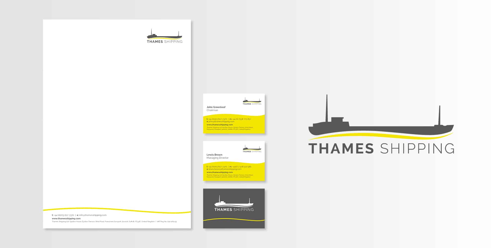
Toast created a logo inspired by one of Thames Shipping’s vessels, Polla Rose. A brightly coloured wave was used as a graphic device that was then applied to various stationery items.
Thames Shipping.
Rebranding a well established and respected shipping company.
Home » Portfolio » All our work »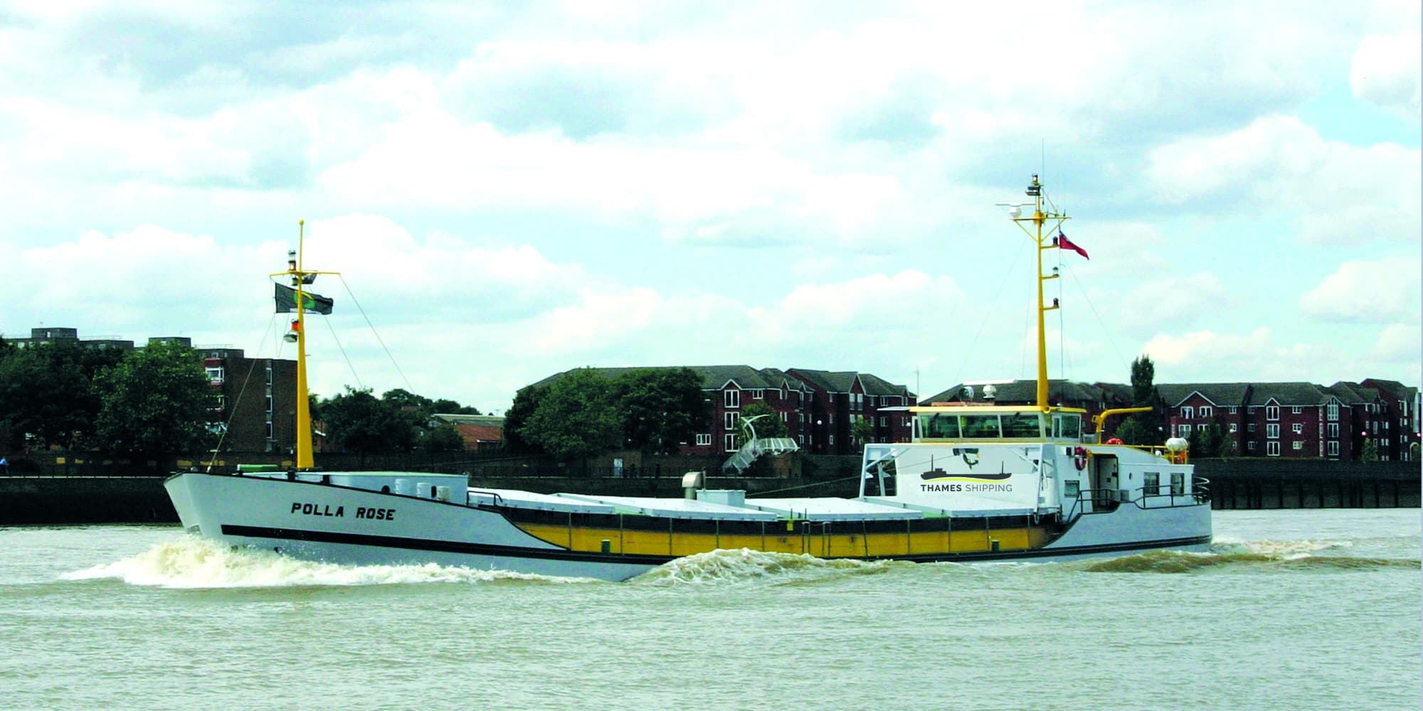
Challenge.
Thames Shipping is a respected name within the freight industry on the river Thames. They identified the need for a Shipping Company Rebrand and engaged Toast to deliver the project.
Approach.
Using mood boards and sketched concepts we established a design style with the client which was then developed into a final design.
Solution.
Stationery.
A letterhead and business card designs were created using the yellow wave to really catch the eye.
Talk to us about your stationery design.
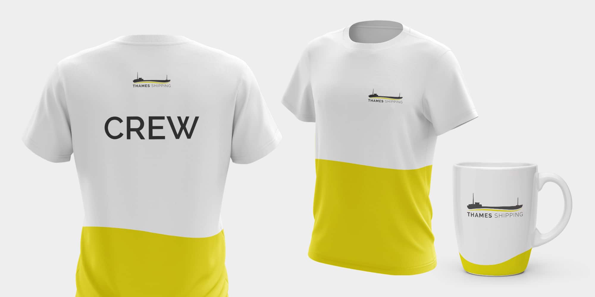
Promotional items.
Toast applied the logo to a mug and t-shirt to show how the brand could work on promotional items.
Talk to us about your branding.