
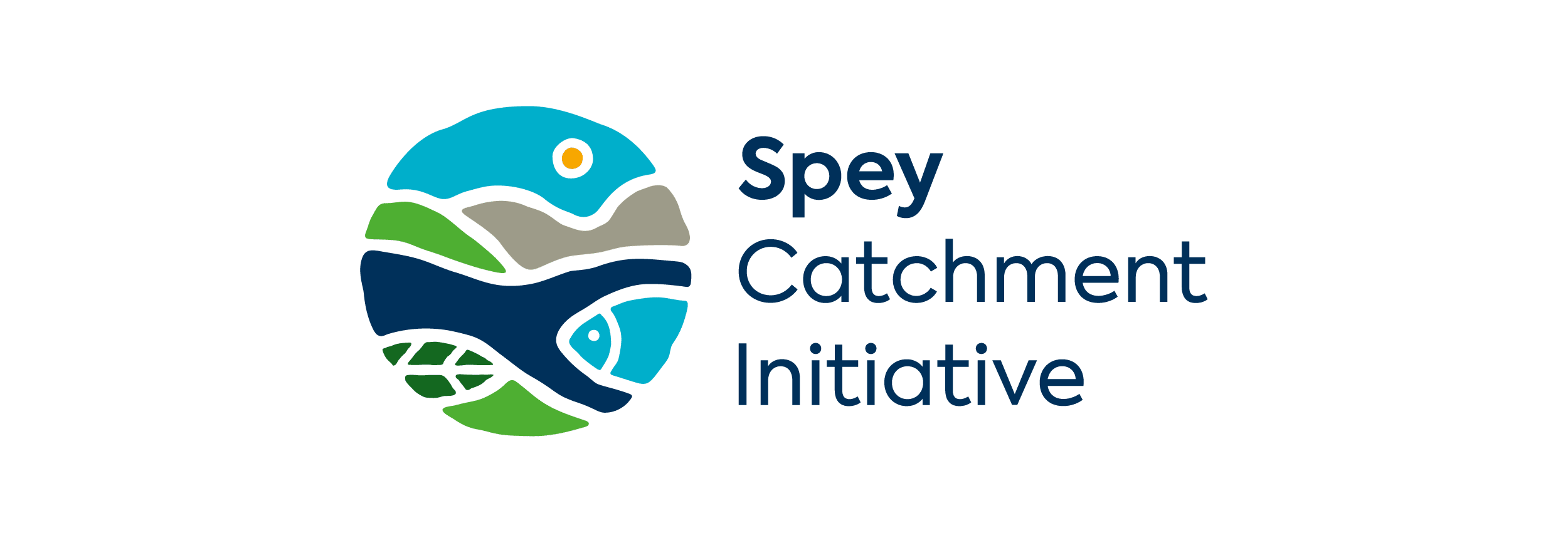
A new identity for one of Scotland’s most important fishery organisations.
Logo design and visual identity
The Spey Fishery Board is the statutory body responsible for the management and protection of the River Spey, one of Scotland’s most celebrated salmon rivers. With a remit spanning conservation, regulation and stakeholder engagement, the organisation needed a visual identity that reflected both its authority and its deep connection to the natural environment.
Toast was appointed to design a new logo and develop a comprehensive visual identity system that would work consistently across all communications.
Building a brand from the ground up.
From discovery through to final artwork, every stage of the project followed our proven branding process.
- Logo design developed through concept, refinement and final artwork stages.
- A complete visual identity system covering typography, colour palettes and usage guidelines.
- Brand guidelines delivered to ensure consistent application across all communications.
Interested in a rebrand or new visual identity?
We’d love to talk about what we could create for you.


More about the Spey Fishery Board project.
About Spey Fishery Board
The Spey Fishery Board is the statutory body responsible for managing and protecting the River Spey catchment in the Scottish Highlands.
The Spey is one of Scotland’s most famous salmon rivers, attracting anglers, conservationists and tourists from around the world.
The Board oversees fishery regulation, habitat protection and stakeholder engagement across the river and its tributaries. With a profile that reaches well beyond the local area, the organisation needed a visual identity that could communicate its authority and reflect the landscape it protects.
The challenge
The Board required a professional logo and visual identity that could carry the weight of a statutory organisation while remaining approachable and connected to the natural environment.
The new identity needed to work across a range of applications, from formal correspondence and reports through to digital channels and signage. It had to convey trust, expertise and a genuine sense of place, without feeling generic or corporate.
Discovery and research
Every branding project at Toast begins with a thorough discovery phase. We reviewed all existing communications and marketing collateral, conducted our own research into how the Board presents itself online, and looked at how comparable organisations across the fishery and conservation sector approach their visual identity.
This gave us a clear picture of the landscape and helped us identify what would set the Spey Fishery Board apart. We also worked with the client to clarify their vision, mission and values, as these underpin everything that follows.
Logo concept and development
With the discovery stage complete, we moved into concept design. We produced a range of initial logo concepts to explore different creative directions, each presented with a rationale explaining the thinking behind it.
The strongest concepts were selected for further development, where we explored colours, typography and refined forms across several rounds of feedback. This iterative process ensures the final logo is not just visually strong but well-considered and right for the organisation.
Visual identity system
Once the logo was finalised, we developed the full visual identity system around it. This covered the logo and all its usage guidelines and lock-ups, a defined typographic system, colour palettes for primary and secondary use, and guidance on how all elements should be applied across different materials.
The result is a cohesive identity system that gives the Board clear direction for everything from reports and letterheads to digital communications, and allows anyone producing materials on their behalf to do so consistently.
Brand guidelines and handover
The project concluded with the delivery of a full set of brand guidelines, giving the Spey Fishery Board everything they need to apply their new identity confidently and consistently going forward.
Final artwork was supplied in all required formats for both print and digital use, along with documentation covering correct and incorrect usage, exclusion zones, colour values and typographic specifications. The Board now has a strong foundation from which to manage their communications with clarity and confidence.

