Designing magazines can be a daunting task for some; avoid some common pitfalls with our helpful guide.
Magazines are part of everyday life, from weekly chat mags to monthly journals & publications aimed at public or private readerships.
The task of creating a magazine or improving an existing one can be a challenge, so here are our top 10 tips on magazine design:
1. Perfect the Cover: Create a Captivating First Impression
The cover is your first chance to make a lasting impression on your audience.
It’s that initial encounter that can determine whether a potential reader decides to delve into your publication or move on.
- Uniqueness is Key: Your cover must stand out among the myriad of visual stimuli that vie for attention. Use of innovative graphics, striking colour schemes, or a thought-provoking image.
- Boldness Commands Attention: A timid cover won’t cut it in today’s competitive publishing landscape. The bolder your cover, the more likely it is to catch the eye of a potential reader.
- Reflecting Your Readership: Your cover should mirror the tastes and aspirations of your target audience. It should be a mirror reflecting the desires, interests, and values of your readers.
- Engagement from the Start: The cover isn’t just a static introduction; it’s a promise of the journey ahead. Make sure it’s an engaging teaser of what lies inside.
Make a statement and engage your reader.
2. Elevate Your Magazine with High-Quality Photography
Invest in good photography, and it will deliver results repeatedly.
Good photography can go a long way in conveying far more than just editorial context; it can support brand values, outlook and ambitions.
Stock photography is ok, but it will never be able to compete with a well-considered and professionally framed shot.
- Visuals Speak Volumes: Quality photography has a unique ability to transcend linguistic boundaries. It can communicate complex ideas, evoke emotions, and tell stories without a single word.
- The Backbone of Your Brand: Your magazine’s photography doesn’t just capture moments; it captures the essence of your brand. The right visuals can reinforce your brand’s identity, creating a lasting impression in the minds of your readers.
- The Uniqueness of Professionally Framed Shots: While stock photography has its place, professionally framed shots add an air of exclusivity and originality to your magazine. These images are tailored to your content, capturing the specific nuances and details that align with your magazine’s focus.
- Compelling Visual Identity: High-quality, professionally shot photographs enhance your magazine’s visual identity, creating a unique and compelling signature.
Let your photography speak for itself.
3. Master the Art of Effective Copywriting
Say what you want to say, and don’t just fill up space with words. Well-written material should be a joy to read as much as it conveys information.
Headlines, subheads and body copy should work together to guide and entice the reader through an article.
Try and make sure you have all your content agreed upon and written before you start the design process; that way, layouts can complement the copy rather than fight with it.
- Beyond Filler Content: Your magazine is not just a collection of words; it’s a platform for storytelling. Ensure that every piece of content you include is well-crafted and meaningful.
- Crafting Captivating Headlines: A well-crafted headline is like a beacon in the sea of content, guiding readers to stories that resonate with them. A great headline can be the difference between a reader turning the page or moving on.
- Subheads as Signposts: Subheads are the subtle signposts that help readers navigate your articles. They break down the content, making it more digestible. They offer a preview of what’s to come, keeping readers engaged and curious.
- Body Copy That Sings: Your body copy should be a joy to read. Well-written content isn’t just about conveying facts; it’s about evoking emotions, sparking thought, and leaving a lasting impact.
- The Symbiotic Relationship with Design: Effective copywriting and design are not separate entities; they’re partners in the storytelling process. It’s crucial to have your content prepared before designing the layout.
Define your tone of voice and maintain it.
4. Crafting a Captivating Contents Page
Set your stall out correctly and create a contents page that both directs the reader and encourages them to explore.
A good contents page allows a reader to quickly access the important information they want to read as well as promote the information they need to read.
A good contents page can establish the structure of the magazine and signpost using page numbers, sections or colours and graphical devices (or all of the above).
- Efficient Navigation: A well-structured contents page serves as a reader’s best friend. It provides a quick and efficient means of navigating the magazine’s content.
- Setting the Tone: The contents page is your magazine’s initial handshake with the reader. It’s the first impression that sets the tone for what’s to come. Use it to create anticipation and excitement.
- Clear and Engaging Roadmap: The contents page should be more than just a list of titles. Utilise sections, colours, and graphics to create visual hierarchies that guide the reader’s eye. Sections can help readers identify their areas of interest, while colour-coding can provide visual cues.
- Page Numbers as Signposts: Page numbers may seem like a mundane detail, but they play a crucial role in reader engagement. A well-organized page numbering system ensures that readers can easily refer back to specific articles or sections, enhancing their overall reading experience.
Guide your reader with a clear and useful content page.
5. Find your style
Build your tribe with a look and feel uniquely yours and flexible enough not to become tired.
It is worth developing a style guide to build familiarity with your reader but make sure that any templates or frameworks offer the ability to keep things visually interesting.
You want your reader to recognise and be intrigued by your style and layout.
- Defining Your Style Guide: Your style guide is your magazine’s DNA. It encompasses the fonts, colours, layout principles, and design elements that define your visual identity.
- Consistency: It assures readers that they can depend on a certain look and feel in each issue. This reliability fosters trust and loyalty. Readers will return, knowing they’ll find the same level of quality and visual appeal.
- Avoiding Complacency: While consistency is vital, it should never turn into complacency. Your style guide is not a straitjacket; it’s a versatile tool. Keep your layout fresh and engaging. A magazine that’s too predictable can lose its allure.
- Building Recognition: A well-crafted style guide ensures that readers recognise your magazine instantly. These are not just design choices; they’re the means by which your readers identify and connect with your content.
- A Balancing Act: Developing a unique style is a balancing act. When you strike a balance, your magazine becomes an ever-evolving masterpiece, offering readers a familiar yet fresh reading experience with each issue.
Consistency is key but avoid complacency.

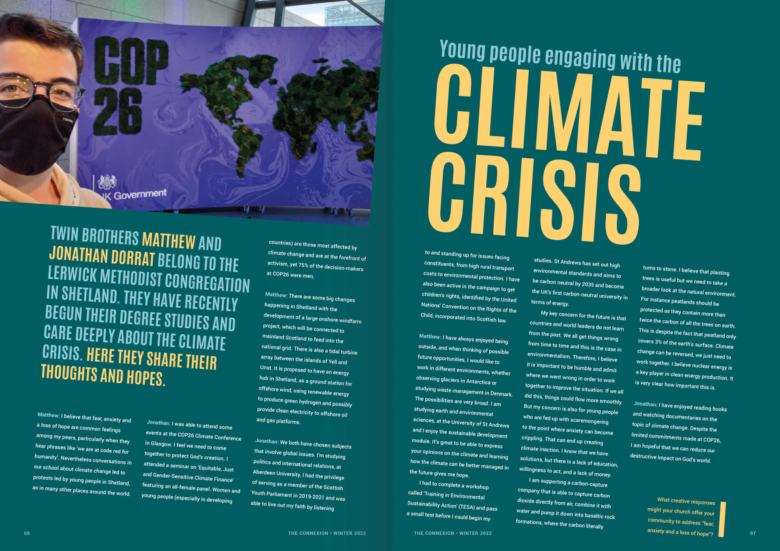
6. Effective Use of Infographics
A well-designed infographic can instantly convey what pages of text can only describe.
The ability to understand complex information quickly and efficiently is perfect for magazines and can be a standalone article in itself.
Or even simple infographics or icons can play a significant role in navigation and signposting key information.
- Transcending Text: At the heart of infographics lies their unique ability to transcend the limitations of text-based communication. They take intricate and often dense information and present it in a visual, easily digestible format.
- A Story in Every Visual: Infographics have the remarkable capacity to narrate a story all on their own. Each graphic is a self-contained story, delivering a message or conveying an idea succinctly and effectively.
- Navigation and Signposting: Infographics can serve as valuable navigational tools within your magazine. They help readers quickly identify and access the content they’re seeking.
- Simplicity Amid Complexity: Infographics are the epitome of simplification. They take intricate information and distill it into a form that is easily understood. A well-crafted infographic isn’t just visually appealing; it’s an educational tool.
Simplify complex text into easily understood infographics.
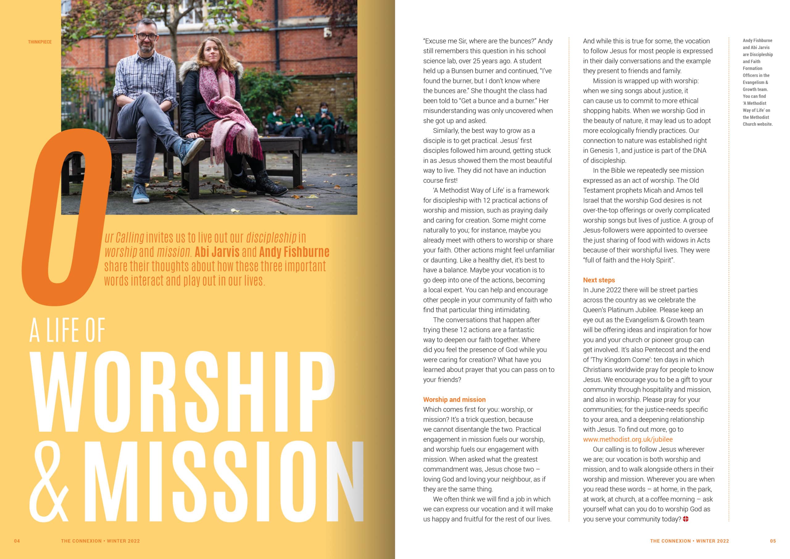
7. The Art of Font & Typography
Tone and meaning can be inferred purely by a change of font, and its arrangement can provide impact and context.
Ensure that fonts & typography are part of your style guide to maximise impact.
Don’t be afraid to use carefully crafted typography as the focus for a page, as these layouts can speak volumes.
Keep an eye out for automatic kerning, as this isn’t always your friend and may need to be tweaked manually for the best possible layout.
- The Language of Fonts: Fonts are like the voices of your magazine. Each font carries its unique personality and can instantly set the tone for your content. Choosing the right font is about aligning the visual character with the essence of your content.
- Typography’s Role in Style Guides: Incorporating fonts and typography into your style guide is a strategic choice. It ensures consistency in your magazine’s visual language. Consistency builds trust and recognition.
- Typography as a Focal Point: Fonts and typography are not mere background elements; they can take centre stage in your magazine design. Well-crafted typography can become the visual focal point for a page or an article.
- The Art of Kerning: The subtlety of typography doesn’t stop at font selection. Kerning, the adjustment of space between characters, plays a critical role in typography. It can fine-tune the visual harmony of your text. Automated kerning tools can be helpful, but manual tweaking is often necessary for the best possible layout.
Unleash the power of typography to make a statement.
8. Grow a spine
The spine of any journal or magazine is a trove of information, from issue number and publication date to key content.
What and how your spine conveys that information should be part of your style guide and paves the way for how your magazines will be stored or archived.
A well-structured spine allows a browser to identify a key issue, a particular subject or a piece of content quickly and easily.
- A Repository of Information: The spine holds a treasure trove of data, discreetly etching the identity of your magazine. It houses the issue number and the publication date, two critical pieces of information for your readers.
- Alignment with Style Guide: The spine should not be overlooked in your style guide. It’s a visual representation of your magazine, and, it should align with the aesthetic principles you’ve set. Fonts, colours, and layout on the spine should be consistent with the overall visual identity of your publication.
- Consideration for Collectors: For readers who collect your magazine or those who have multiple issues, the spine takes on added importance. It’s not just about facilitating quick identification; it’s also about creating a cohesive visual identity when multiple issues are displayed or shelved together.
- Aesthetic Appeal: While the spine is primarily functional, it shouldn’t be devoid of aesthetic appeal. It’s an opportunity to enhance your magazine’s visual identity. Readers may be drawn to the magazine on the shelf because the spine caught their eye.
Consider how spines will sit next to one another in a collection.
Finishes and Stock
A glossy magazine is a term many people use, and it comes with a certain expectation or presumption.
Be aware of how your readers will respond to the weight and finish of your magazine and what they would infer from it.
Uncoated paper stock may be considered more environmentally friendly, yet foil blocking or embossing may be considered more valuable.
- Weight and Finish: Crafting Perception: The weight and finish of your magazine are not just utilitarian choices; they are instruments of perception. A glossy, heavyweight stock may convey a sense of luxury and opulence, while a matte, uncoated paper might imply environmental consciousness.
- Reader Expectations and Preferences: The materials you select should be in tune with your target audience’s expectations and preferences. Different readers have diverse tastes. Knowing your audience is pivotal in making the right choices.
- Consistency with Brand Values: The choice of paper stock and finishes should align with your magazine’s brand values. If your publication aims for a sense of elegance and refinement, a smooth, high-gloss finish might be the right fit.
- The Unseen Artistry: The sensory qualities of your magazine don’t end with visual appeal. The touch, the scent, and even the sound of pages turning are all part of the holistic reading experience.
Make sure your stock and finish match your reader’s expectations.

10. Digital version
It is worth considering using the artwork to create an online version if you have a printed magazine.
Many magazines have gone digital only, but it is important to provide your reader with their preferred medium.
Readers may like the idea of being able to switch between hard copy and digital as they move around, so a digital version is an obvious benefit.
- Catering to Diverse Preferences: In the age of digital transformation, readers exhibit a wide range of preferences. Offering both paper and digital formats means you can cater to readers’ varying tastes, ensuring that your magazine is accessible to a broader audience.
- Seamless Transition: A dual-format approach offers a seamless transition between print and digital reading. Readers can switch between the two, adapting to their specific needs.
- Cost-Effective and Eco-Friendly: Digital publications are often more cost-effective to produce and distribute compared to print. There’s no need for physical printing, paper, or postage costs.
- Rich Multimedia and Interactivity: Digital publications unlock a realm of possibilities for enriching your content. You can incorporate multimedia elements like videos, animations, and interactive features.
- Global Reach: Digital publications transcend geographic boundaries. Your magazine can reach readers worldwide, expanding your audience and your publication’s influence.
Talk to your designer about the benefits of digital publications.
Magazine design at Toast
Toast has been helping customers to create, maintain or evolve their magazines for over two decades.
Our clients have used magazines to sell luxury yachts, planes and cars to the super-rich and have created communities for charities or housing associations.
The ability of magazines to reach out and engage an audience means they are an essential tool in communicating with audiences across a whole range of sectors and industries.
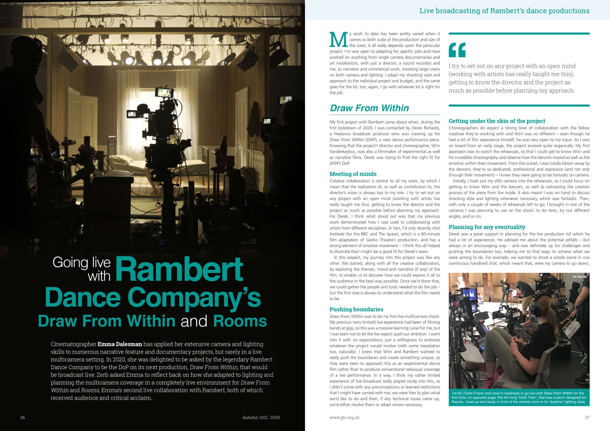
A great example is a work we have done with Zerb magazine, a private publication for the readership of the GTC (Guild of Television Cameramen).
We have been working closely with the editorial team since 2007 and have the lead on constantly evolving the magazine to improve the reading and engagement experience.

