Illustrated Maps: Clear, Fast, and Built to Be Used
Illustrated maps sit in a clean space between information and story.
They show a place or journey with intent.
You trade perfect scale for precise meaning. An illustrated map is not a survey tool; it is a guide built to help people find what matters.
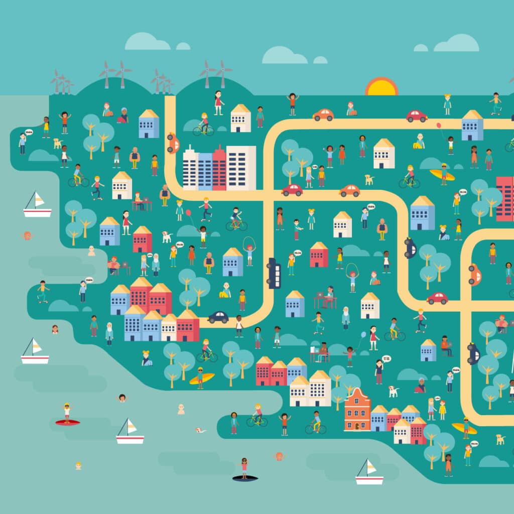
An illustrated map makes the route, the landmarks, and the idea obvious in seconds.
Brands pick illustrated maps because they stand out and stick. You get an image that says, “This is us, and this is where to look.” You can match line style, colour, and tone to your voice.
A personal note: illustration adds warmth that flat graphics can’t reach. I like the hand drawn feel because it shows care. Someone spent time on this piece. That touch reads as quality.
What an Illustrated Map Includes
Think of it as a kit of parts. Illustrated maps include:
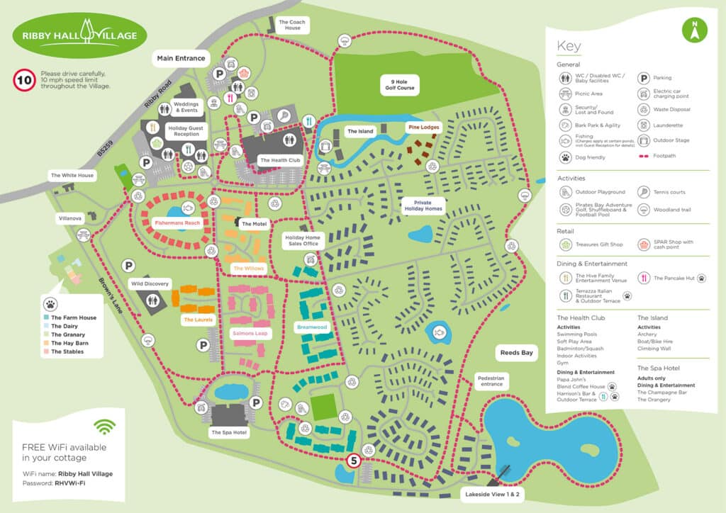
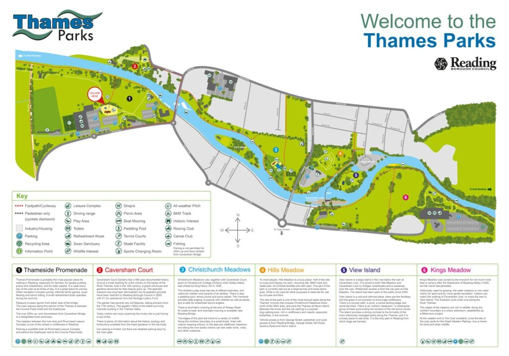
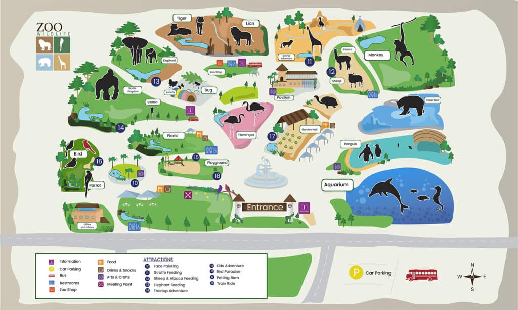
- A base shape of the area (city, campus, venue, route, district).
- Landmarks with clear icons and labels.
- Paths, routes, loops, zones, and cutaways where they help clarity.
- Pointers for key stops: entrances, stages, stands, stores, cafes.
- Brand motifs: colour palette, line style, patterns, tiny easter eggs.
- Copy blocks: a short legend, a call-out, or a key message.
- Optional cutaways for buildings or layers that need a peek inside.
- Simple cutaways for levels, tunnels, or backstage routes if you need them.
- Light animation frames and UI cutaways when a tooltip needs context.
Deliverables can be set up for web and for print. Vector scales; raster adds grit. Pick the route that fits the job, not what’s trendy. A hand drawn base can be scanned and created in vector later. Both paths work if clarity stays high.
Why Brands Use Illustrated Maps
Illustrated maps buy you attention in a sea of stock assets.
- They look like you, not like everyone else.
- They help people find a layout fast.
- They improve recall because the shapes, icons, and colours are yours.
- They make strong hero images across feeds and print runs.
- They push teams to be clear. You cannot put everything on one map and expect it to perform.
Copy leads; design follows. Playful lines for a festival, neat geometry for a fintech site, warm textures for a food trail – illustration lets you choose the tone. Nate Padavick’s work helped popularise illustrated maps online and nudged more teams to make their own styles.
High-Impact Use Cases
- Campaign hero images. A city map that marks your stores, pop-ups, or service areas.
- Event and festival wayfinding. Gates, stages, toilets, food courts, first aid, and “you are here.”
- Museums and attractions. A friendly guide that turns a maze into a tidy route.
- Campus maps for HQs and visitor guides. On-brand, human, and easy to update.
- Editorial guides for cities and districts. Think a series of illustrated maps for cities like London, Bristol, and Manchester.
- Product or service journey maps. Not geography – steps a user takes on a page.
- A country map for national campaigns or cities roll-outs.
- Framed city maps make a solid gift for launches or team wins.
Styles and Composition
Start in black and white. Fix the story before style tests. Keep styles tight – two or three options at most.
Illustrated maps can be hand drawn, fully vector, or a hybrid. Keep line styles consistent. Limit texture so labels stay legible. Use icons with one visual logic. That is the simple way to keep maps readable across sizes.
I like small, human details. A tiny queue outside a venue. Trees that match your brand leaf shape. Clear water lines. Subtle cutaways where detail helps someone find a lift or a tunnel.
Process and Realistic Timelines
There are two routes: go via your agency or commission a map illustrator direct. Some agencies have a map illustrator in-house, which keeps the project tidy.
- Brief and objectives (1–3 days).
Define outcome and audience. Write what the map must say. Words first or you risk chaos. - Research and references (2–5 days).
Gather base geography and venue plans. Pull brand assets. Confirm accuracy (clear, not legal). Set availability with your map illustrator so the schedule is real. - Sketches and composition (3–7 days).
Rough illustrated maps in mono. Explore focal points, balance, label areas. Agree the story. - Style tests (1–2 days).
Small swatches of line, colour, texture. Keep styles focused. - Illustration build (5–15 days).
Draw the illustrated map, created icons, tune the label system. Vector first for export sizes. Add texture if your brand calls for it. - Feedback rounds (1–3 days each).
One owner. One list. Fast, clear rounds keep the project moving. - Final prep and delivery (1 day).
Export web packs, a usage note, and a tidy legend.
Typical totals:
- Simple map (small area, few labels): 2–3 weeks
- Mid-level (district/event with zones): 3–5 weeks
- Complex (city scale, many icons): 5–8+ weeks
If copy or sign-off drifts, the schedule drifts. Commissioning early helps you lock dates; late commissioning often means waiting for the next slot.
What Affects Time and Cost
- Scale and scope. Street level needs more drawing time.
- Landmarks and labels. Each icon takes time; each label needs space.
- Number of outputs. One hero file is faster than six sizes.
- Revisions and sign-off speed. Slow, circular loops kill momentum.
- Content readiness. Clear copy makes the build faster.
- Stakeholders. More voices mean tighter rounds are vital.
- Rights. If you plan a product line or global use, set the licence before you purchase anything.
How to Brief a Map Illustrator (Use This Checklist)
- Goal. What should the illustrated map make people do or understand?
- Audience. Who is reading it? What do they care about? One crisp audience line.
- Primary message. One line for a Post-it.
- Geography. Bounds and must-include spots across places and cities.
- Brand assets. Colours, type, logos, good examples.
- Labels and copy. Names that are final or “90% there.”
- Output list. Web sizes, any light motion, any interactive layer.
- Deadline and sign-off chain. Name one owner.
- Budget and rounds. Agree how many rounds count as a change.
- Commission. If this is a series, say so now for consistency.
- Commissioning. Confirm the start date with your map illustrator.
This is boring paperwork that saves weeks later. It also makes the next project faster.
Files, Handover, and Future-Proofing
Ask for clean source files and a tidy export pack.
- Master files. Vector AI/SVG/PDF. Named layers.
- Textures. Keep linked PSD/Procreate files.
- Label styles and legend. Sizes, text styles, swatches.
- Versions. Use version numbers and a change log.
- Ownership. Agree rights in the quote. When you pay for custom work, you should own the final art and get the masters.
- Keep it lean. Do not load assets you do not need.
Pitfalls to Dodge
- Starting with visuals. Words first or you chase your tail.
- Asking for endless options. Pick a route and commit.
- Over-design. A map is a guide, not a showreel.
- Stakeholder soup. Too many voices with no lead wreck timelines.
- Designing blind. Plan the map; then draw.
“Find it fast” Checklist
Use this to help people find what they need in seconds.
- Find the entrance.
- Find the exit.
- Find toilets.
- Find first aid.
- Find food courts.
- Find stages.
- Find your stand.
- Find quiet zones.
- Find baby-change.
- Find water points.
- Find lifts.
- Find step-free routes.
- Find ticket desks.
- Find help desks.
- Find cloakrooms.
- Find bike parking.
- Find bus stops.
- Find taxi ranks.
- Find your route across the place with one glance.
Measuring Impact
- Unique QR codes or URLs per map asset. Track scans and visits.
- Web stats. Track time on image and hotspot clicks to back a lead or sale.
- Events. Check info-point questions. Good layout reduces “I’m lost.”
- Organic search. Branded illustrated maps for cities can win links and mentions.
Short FAQ
Are illustrated maps accurate?
Accurate enough to guide the user. You draw for clarity, not legal lines.
Can we animate later?
Yes. Plan layers up-front and you can add simple motion without redrawing the illustrated map.
Who owns the artwork?
Set it in the contract. When you pay for custom art, you should receive the master files and the rights agreed.
Can we update next year?
Yes. Keep a neat, layered master. Update labels, add zones, or export new sizes. Your clients and teams will thank you.
Final Notes for Brands
Illustrated maps are tools. Do the boring bits up-front – message, structure, sign-off – and you get an on-brand illustrated map that people use. Keep the process lean and the styles simple.
If you plan to commission one, start with the brief, outline the project scope, and say where it will run: cities launch, HQ guide, or museums with special interests. If you want to purchase a licence for wider use, say so now. If you want framed city maps for a team gift, say that, too.
I offer two easy options: work with your agency, or commission a map illustrator direct. Either way, you get illustrated maps built for the real world, so people can find what they need fast and move on.
If you need a hand getting started, email me. I’ll look at your brief, confirm availability, and get your illustrated map created.


