Specifying colours – from screen to print and how these differ
Whether you’re just about to start your design project or in the finalising stages, specifying colours you want can get complicated as there are many systems involved that display the colour you want differently. Why is this and how can you get the best results when specifying colours?
In the design world we view colours in 2 physical formats, digitally on a device such as a computer monitor, tv or ipad, and print such as brochures and magazines. These 2 formats use different ways of representing colour, RGB for digital devices and CMYK for printed materials, so the colour you see on screen will not exactly be the same as it is when printed.
If you have a question about design, Talk to Toast Today
(See my article about the difference between RGB and CMYK for further details).
To help remedy this difference, colours are given codes to reference. There are several colour reference/code systems for each format and these include:
Digital
HEX code (or sometimes referred to as web), looks like this: #f28b00.
RBG ref (red, green and blue), looks like this: R=242, G=139, B=0
There are also other colour systems such as Lab.
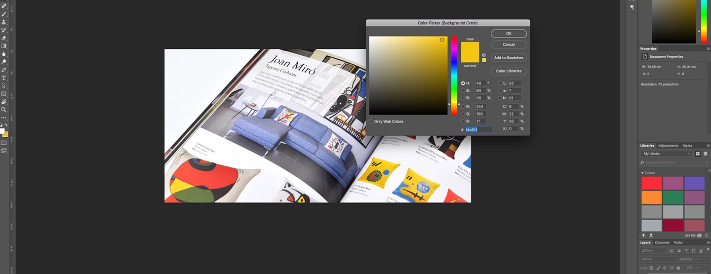
PMS or Pantone Matching System (sometimes referred to as Spot colours) and tend to look like this: 144C or 144U (C after the figure is for coated, U for uncoated).
CMYK ref, look like this: C=0, M=50, Y=100, K=0 or sometimes shortened to 0,50,100,0
Variations
At this point, it would be good to mention each system can slightly change the colour you choose.
- For digital – the device itself will display a colour differently from another, this is down to the different manufacturers but mainly due to how you have your screen/monitor set-up, the resolution and how it is calibrated.
- For print – If you choose a PMS colour the CMYK version of this will slightly differ (especially in blues). Also the paper you have this printed onto will affect the colour as various papers absorb the pigments differently. Another thing to consider is that any finish you apply over the colour (such as lamination) will darken or dull down the colour. The location you are standing in also affects the colour, in an artificially lit office, a colour will look different to when you look at this under natural sunlight.

So you have chosen a colour, which most commonly you have seen on your screen and you now want to use this colour in your brochure, what do you do next?
- Send a reference of this to your designer, there are various ways of doing this, these include taking a screengrab or forwarding a jpg which contains the colour. If you know how to get a colour breakdown (from using software such as Photoshop) in RGB or CMYK then send this.
- Once this has been inserted or used in your brochure the designer should then first send you a proof, normally a PDF for quick reference. If this is looking good and in the right area then the designer can get physical digital-proofs from the printer before you proceed, but if this isn’t looking good or if you are unsure then,
- Meet with the designer and physically pick a colour from a swatch book that they will have. Depending on what you have chosen the designer will be able to show you the colour on a swatch (a bit like you see when choosing paint). The important thing here is choosing the correct colour as you see it, not how it looks on screen.
- The designer should then supply a digital proof (or if for high specification projects a wet proof) for you to check and sign-off.
Of course, if you have already gone through this process before and have colour references you can send to your designer that you are happy with a lot of this you won’t need to do, but we would always advise getting some sort of proof if using new colours or new printers.
What about the other way around? That’s easier as you should be able to gain a colour reference to use on screen from the print artwork. If you didn’t create the printed material then you would have to match this with the designer using colour swatches and choosing a colour reference from there. The designer can then tweak the colour if needed on screen to get the best match.
In summary
As you can see there are a lot of variables to consider and getting a colour exact over a large range of digital and print uses is very difficult and you might need to be flexible and go with the best match approach to some uses. The biggest potential mistake (and cost) is not getting a colour proof before progressing with print as the colours you see on screen might not be the same when printed, if there is any doubt get a proof.
If you have a question about design, Talk to Toast Today
Looking for something different?
If you found this helpful you might be looking for a new agency that likes to support its clients. We have created a service specifically for clients looking for quick turn-around, high volume and no-nonsense design service, we call it Toast Design Services. Check out our new Graphic Design Subscription Packages, tailored to their ongoing needs.
