Infographics are becoming ever more popular as they are great at presenting information in a quick, clear and informative format.
Infographics can also be used in annual reports, presentations, websites, and other marketing collateral design, giving you a powerful tool that can be applied to various materials. Infographic design also provides a great visual shortcut to complex information, as people find it easier to relate to and retain image-based information. Infographics have been used for marketing purposes since the 19th century (yes, really!) and continue to be an effective tool for marketers today.
Toast are experienced infographic designers – we can help you create the perfect infographic design, whatever the brief.
What is an infographic?
An infographic visualises information, data, or knowledge intended to present complex information quickly and clearly. It combines text, images, icons, and graphics in a visually appealing format to communicate ideas or data more engagingly and understandably than plain text. Infographics are commonly used in presentations, reports, websites, and social media to convey information on various topics, such as statistics, processes, timelines, comparisons, or explanations. They can help simplify complex concepts, highlight key points, and enhance audience comprehension through visual storytelling.
Infographics are 30 times more likely to be read in their entirety than blog posts or news articles.
When should I use an infographic?
You should consider using an infographic when you want to:
- Simplify complex information: Infographics are great for breaking complicated concepts or data into more digestible and visually appealing formats.
- Visualise statistics or data: If you want to present statistics, data points, or survey results, an infographic can help you visualise them in a way that is easy to understand and memorable.
- Highlight key points: Infographics effectively emphasise key messages or important information by using visuals to draw attention.
- Tell a story: If you have a narrative or story, using an infographic can help you convey it more engagingly and effectively than plain text.
- Engage your audience: Infographics are visually appealing and can help capture and maintain your audience’s attention, making them particularly useful for presentations, social media posts, or websites.
- Share information quickly: Infographics are often more quickly understood than text-heavy content, making them a good choice when communicating information efficiently.
- Stand out: In a sea of text-based content, infographics can help your message stand out and make a stronger impression on your audience.
Toast creates infographics for a range of clients, and all follow some basic guidelines; these include:
- Emphasise a key fact or message
- Easy to understand
- Quick to extract key information
- Format follows function
Let’s take a closer look at each of these points.
Infographics can enhance your communication.
1. Emphasise a key fact or message
Ensure the infographic design displays the key message and is what you automatically see when first looking at it. If you are comparing multiple facts, then these become the main focus. Don’t get lost in the details and try to present too much information at once. If you can’t see the key point that your infographic is illustrating, chances are that your audience can’t either.
2. Easy to understand
There is no point in creating a visually stunning infographic if the viewer doesn’t understand what they are looking at, or what information you are trying to display. Keep it simple – using a clever visual device or icons helps people relate to the key facts, and don’t overcomplicate things with unnecessary graphics that might confuse them.
3. Quick to extract key information
Extracting key information from an infographic involves a systematic approach to understanding its content and identifying the most relevant data or messages. We tend to scan for key information before we deconstruct the image in its entirety. Ensure the infographic design is structured in a format that all key information is easily extracted, having the viewer trying to add something up in their head can introduce the possibility of an error, so display all key figures so that there is no room for error.
4. Format follows function
What format best displays the infographic’s main function/fact? That depends on what you’ve got to say.
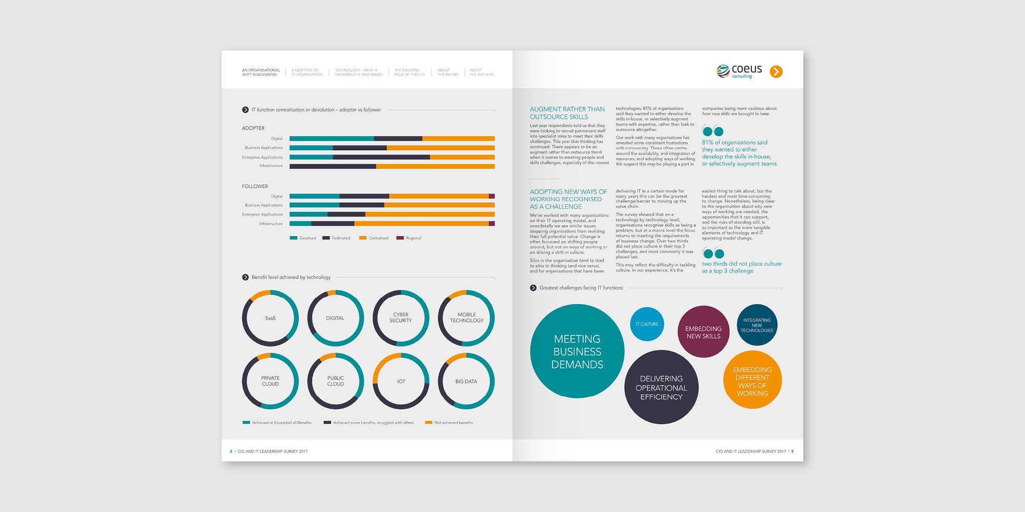
Statistical infographics focus on presenting numerical data. They often use charts, graphs, and diagrams to visualize numerical information, making understanding trends, comparisons, and relationships easier. Timeline infographics organise information chronologically, showing the progression of events over time. They are useful for illustrating historical events, project timelines, or concept evolution.
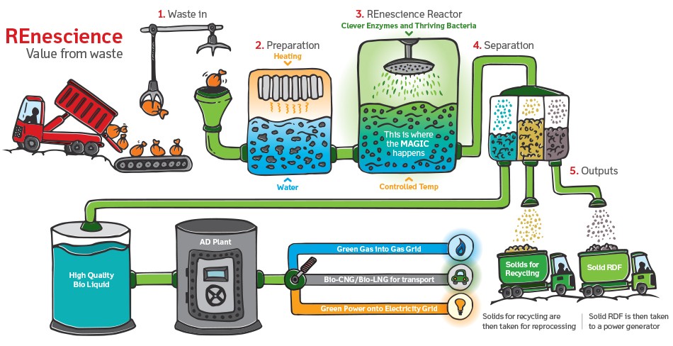
Process infographics break down a complex process into sequential steps. They use visual elements like flowcharts, diagrams, or icons to guide the viewer through each process stage, making it easier to follow and understand. Hierarchical infographics represent information in a hierarchical structure, with the most important or broadest concepts at the top and more specific details branching out below. They are useful for organising complex information and showing relationships between different hierarchy levels.
Map infographics use geographical maps as a visual backdrop to convey information related to locations, demographics, distribution, or spatial relationships. They are effective for presenting regional data or illustrating global trends.
5. Accessible design
We also create infographics for our clients using Canva template designs so the infographics can be edited and tweaked quickly and exported in any format you need.
This makes editing infographics or creating variations very simple and accessible.
Toast can create a perfect infographic design for your website, marketing materials or social media, get in touch and one of the Toast team will talk to you about creating your next infographic.
