The bold, yet simple final logo clearly conveys the growth-orientated nature of the business and the separate icon design elements create strong brand elements that can be applied to other marketing and visual collateral.
Growth Optimise.
Creating an icon-based logo design for a growth and development company.
Home » Portfolio » All our work »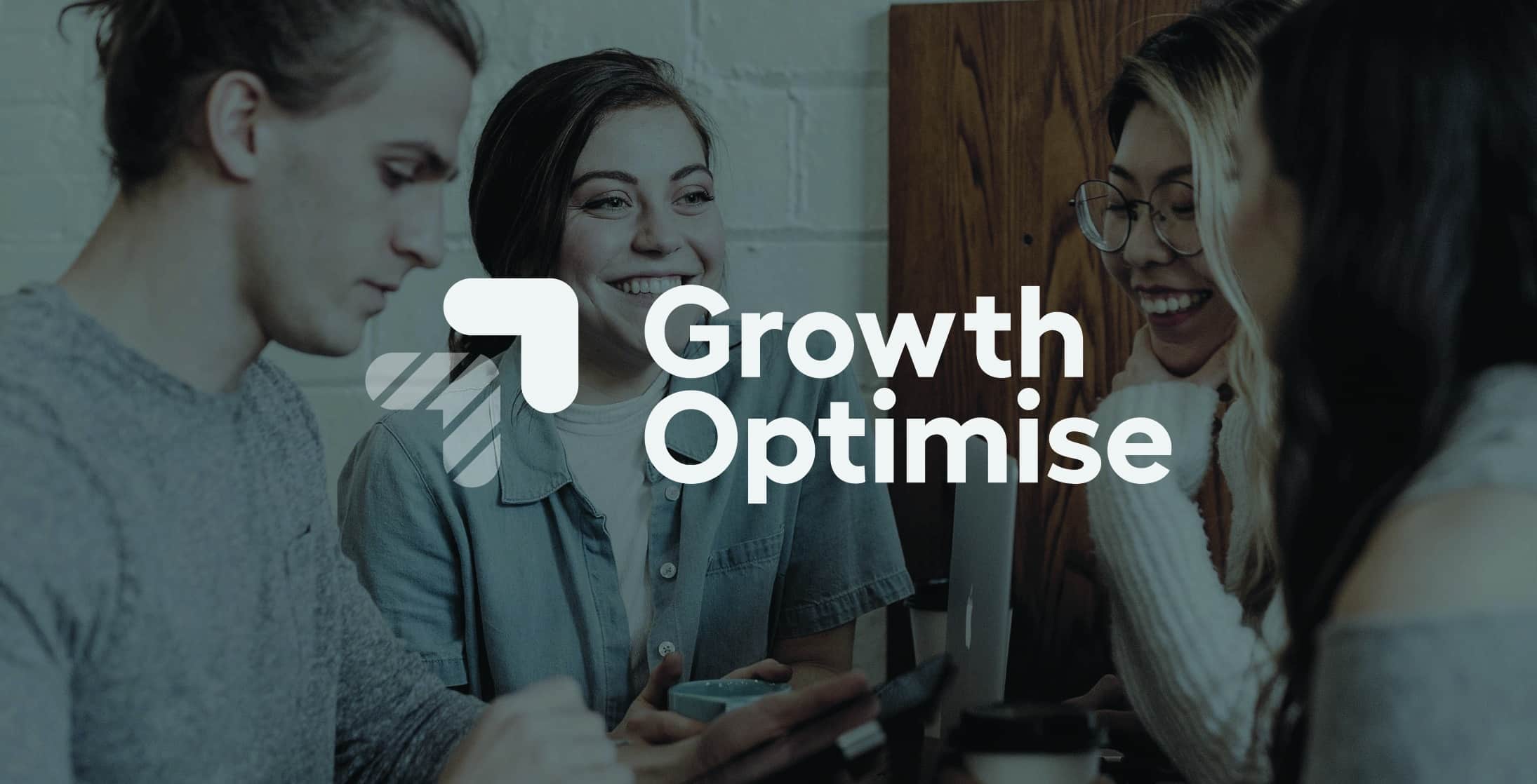
Challenge.
Growth Optimise approached Toast with a business name and a description of what the new startup was about and its’ offering. Our brief was to create a clean and simple logo design that reflected the nature of the business.
Approach.
We started this project on paper with lots of initial sketched concepts to explore potential creative direction before selecting concepts to take through to development.
Solution.
Logo variations.
With any logo we create, planning out what the final logo will be used on and how it might be used generates logo variants that give the final design flexibility to be used across a wide range of media.
Growth Optimise is a digital business, so it was crucial that the logo was able to work in different colourways and sizes.
Get started on your logo project.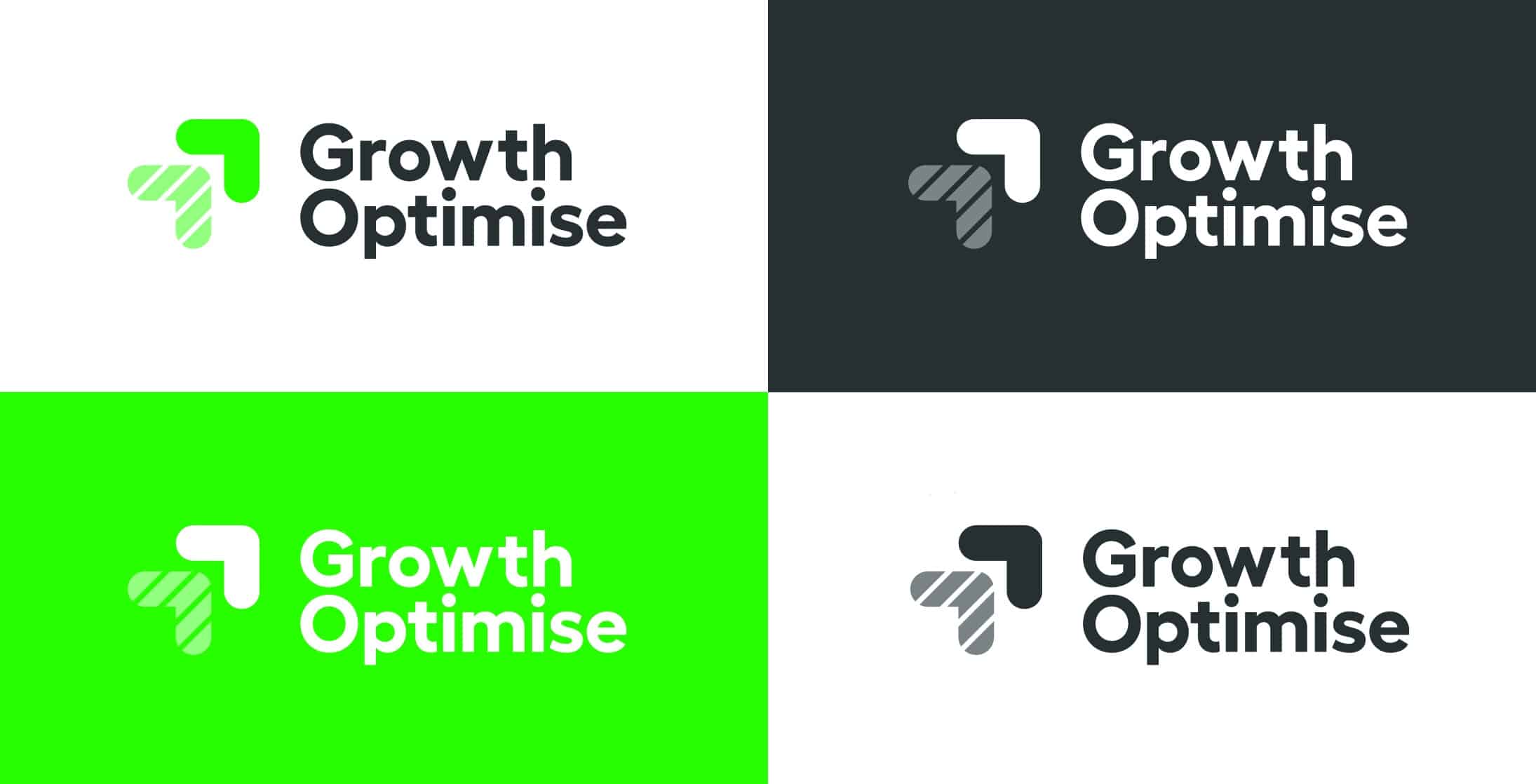
Design Concepts.
For all logo work, we create a wide range of initial design concepts to explore the creative possibilities for the project.
Working up initial sketches and thoughts into more polished designs helps our clients really visualise the directions we are suggesting for the project.
Start a logo design project.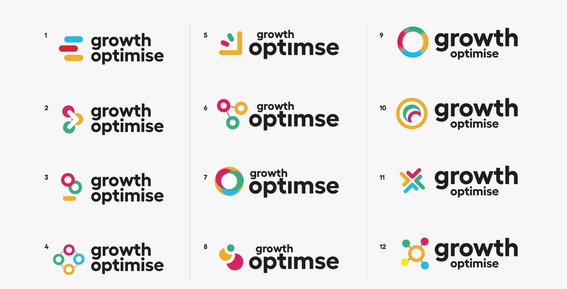
Style guides.
All our logo projects include application considerations for the logo moving forward. If the budget allows, we always suggest a basic style guide is created for the logo to outline its use.
For this project, we outlined basic logo usage guidelines for spacing and fonts.
Font usage.
Part of the project involved sourcing and selecting appropriate fonts for both the logo and for further use across print and digital. Choosing a clean and crisp font that worked to complement the bold lines of the logo icons created a flexible and accessible font library for the Growth Optimise team to use moving forward.
Need a new logo? Get in touch.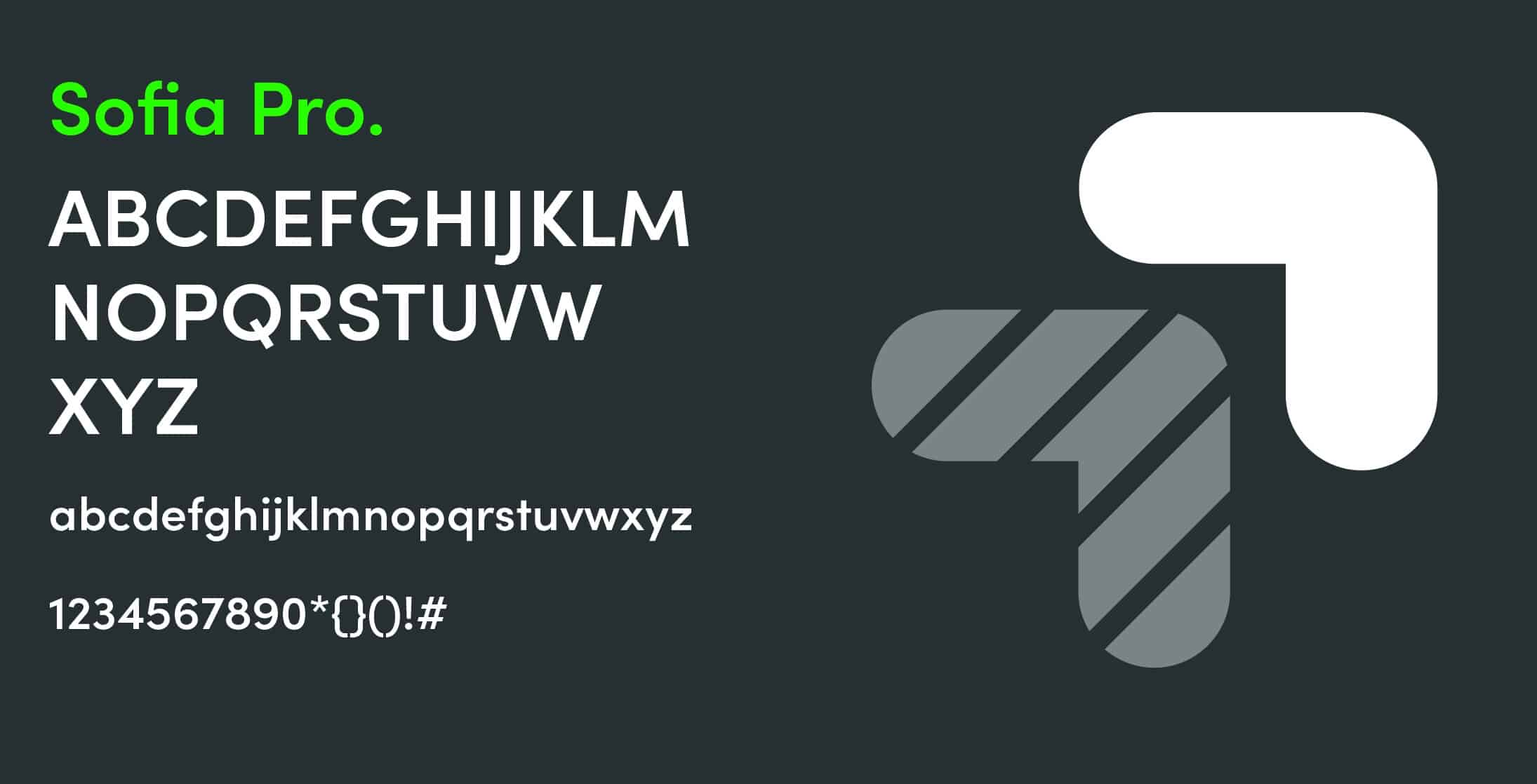
Additional design elements.
Icons
We also designed a set of icons as part of the overall brand that was designed to be used across the website and other marketing collateral.
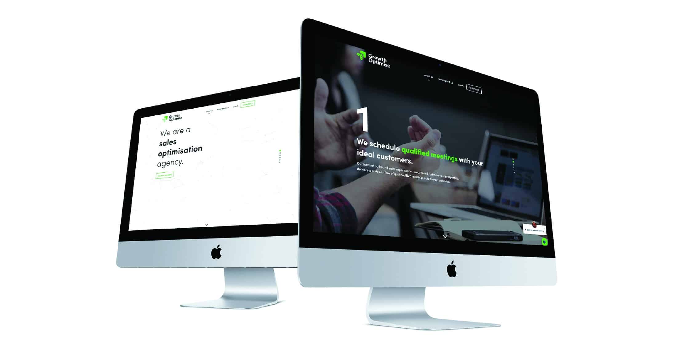
Website
As well as completing the logo and branding aspects of the project, we also designed and built a bespoke WordPress site for the startup.